Print-Ready Artwork for Packaging in South Africa Guide
A carton file can look finished on screen and still be nowhere near ready for a press. The gap between the two is where most avoidable delays start.
This guide sets out the artwork and print-ready file requirements for packaging in South Africa, in the order you build them: dieline, bleed, colour, export settings, finishes and proofs. It is written for brand managers, packaging managers and agency teams who sign off files on runs of 2,000 to 50,000 units. It does not replace your converter's own file specification, which always takes priority over the general figures here.
Why artwork errors cause packaging reprints
A reprint repeats everything the first run consumed. That means the board, the plates or screens, the press time and, usually most painfully, the launch date your retail buyer has already scheduled around.
On a run of several thousand cartons, even a small fault is expensive because it is multiplied across every unit. The same few faults turn up again and again: missing bleed, RGB artwork, outdated dielines and unembedded fonts. Each one is easy to catch before release and hard to fix once board has been printed and cut.
Our packaging reprint errors article covers the wider cost picture. This guide deals with the cause nearest to you: the file itself.
Most of these checks take minutes, and they are far cheaper than a second run.
Set up the dieline and bleed before design starts
Build the pack on the dieline first and design second. Artwork that is resized to fit a dieline afterwards is the usual route to a barcode on a fold or a logo that meets a glue flap.
Packaging dieline requirements for folding cartons
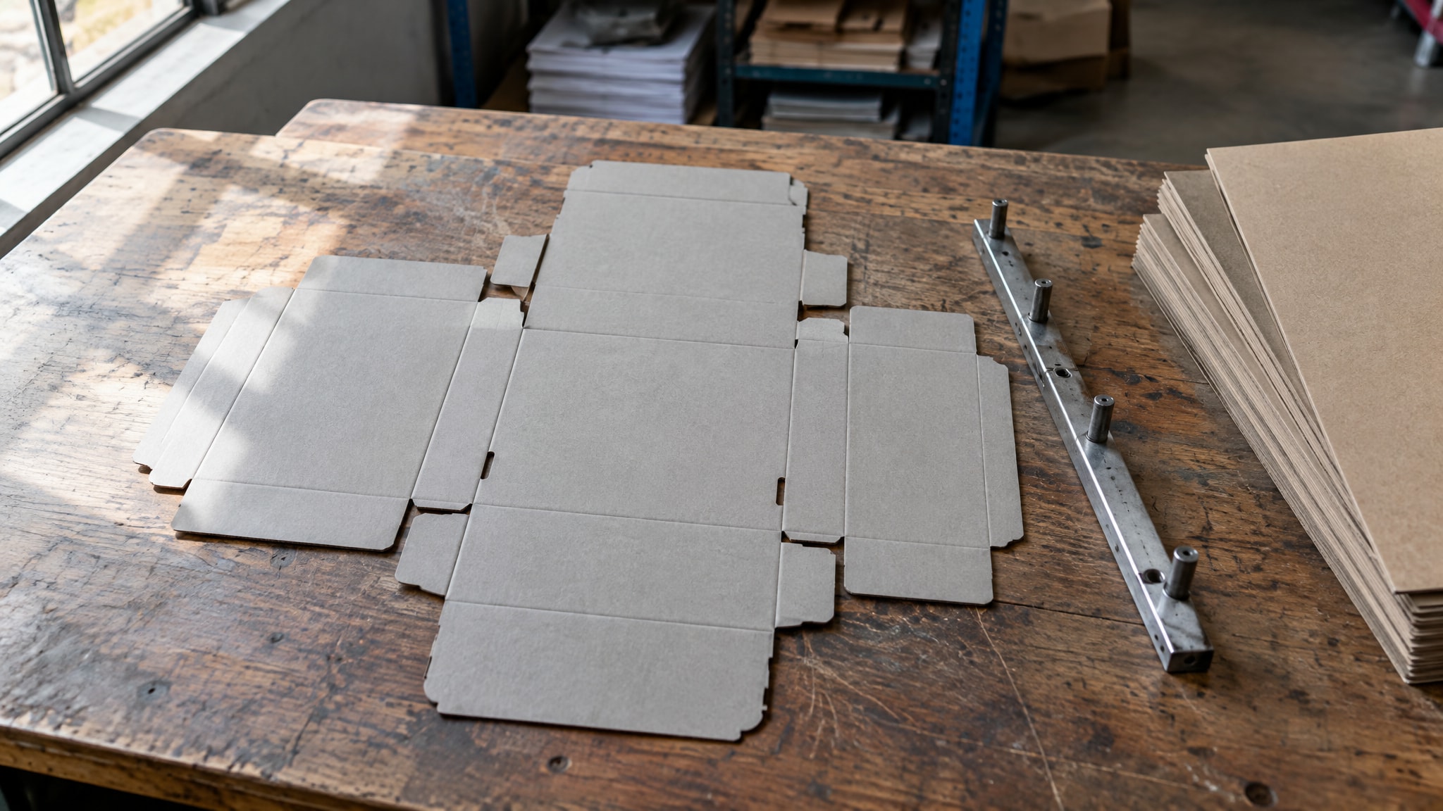
A dieline is the flat plan of the carton. It shows where the board is cut, where it is creased and where glue is applied, so you can see how the flat sheet becomes a three-dimensional pack.
Always work from the converter's current dieline template for cartons. A guessed size, or a template from an older job, will not match the tooling the converter holds today, because cutting dies are adjusted over time and board specifications change. Even a few millimetres of difference moves a fold through your artwork.
The template should arrive as a 1:1 vector file. Keep cut and crease on separate, named layers, and keep those layers out of the print file so no guide line prints on the carton.
 bleed edge  - - - - - - - - - - - - - - - - -
             :                               :
 cut line    +-----------------------------+   (solid line)
             |  safe zone edge             |
             |   +---------------------+   |
             |   |  logo, barcode and  |   |
             |   |  copy sit in here   |   |
             |   +---------------------+   |
 crease      + - - - - - - - - - - - - - - +   (dashed line)
             |  glue flap: keep clear      |
             +-----------------------------+
If you are redesigning an existing pack, ask for a fresh template before you open the old file. A template that was correct two years ago may not be correct now.
Bleed and safe zones around the cut line
Bleed is artwork that extends past the trim so the cut never exposes bare board. A common figure is 3 mm, but your converter's figure is the one to use.
The reason is simple. A dark carton panel whose colour stops exactly at the trim will show a thin white sliver as soon as the cut drifts slightly. The same panel with bleed hides the drift completely.
The safe zone works the other way. Keep logos, barcodes and copy several millimetres inside the trim, and clear of folds, glue flaps and seams. Cutting and folding both move by a small amount, so anything placed close to the edge will eventually land on it.
Check the board grain direction before any text sits near a fold. Board folds more cleanly with the grain than across it, and a crease against the grain can crack the printed surface.
CMYK vs Pantone packaging artwork: which to use
Colour is where brand teams and converters most often disagree after the fact. Settle the colour plan before artwork is finalised, because it decides how many inks the job needs.
Your choice is between building colours from four process inks or specifying a pre-mixed ink. Neither is better in every case, and the right answer depends on what the pack carries.
When CMYK process colour is enough
CMYK, built from cyan, magenta, yellow and black, suits photography, gradients and artwork with many colours. It is also the most economical route, because the job runs on the standard four units.
If your pack is food photography, a lifestyle image or a multi-colour illustration, CMYK is almost always the correct choice. Convert any RGB files to CMYK yourself, and review the result on screen, because bright blues, greens and oranges can shift noticeably in conversion.
When a Pantone spot colour is worth it
Reserve Pantone spot colours for key brand colours that must match across cartons, labels and future reprints. A spot ink is mixed to a formula, so it holds a colour far more consistently than a CMYK build.
That consistency has a price. Each spot can add a print unit, which adds cost, and it adds a colour to check at proof stage.
There are three cautions to build into the plan:
- One Pantone reference reads differently on coated and uncoated board, so the same number will not look identical on both.
- Many digital presses approximate spot colours using CMYK, so the match may be close rather than exact.
- Every colour should be judged on the real substrate, not on a screen or a swatch book alone.
The press itself changes how well a spot colour holds. Our guide to digital or flexo label printing explains how each process affects the match, and it is worth reading before you fix the colour plan.
Set up print-ready artwork files for South African packaging
Treat the file as a packaging artwork specification that your converter can run without a round of queries. If a prepress operator has to email you three questions, the job has already lost time.
Specifications differ between converters, so request the current one before you export. The settings below are common starting points, not a substitute for it.
Export settings for a print-ready PDF
Supply a CMYK print PDF. PDF/X-1a and PDF/X-4 are common ISO-based choices, and your converter will tell you which it prefers. Both are designed to produce predictable output.
A correct file contains:
- CMYK colour, with the press's ICC profile where the converter supplies one
- Bleed at the converter's figure
- Crop marks outside the bleed
- Fonts either outlined or embedded
- Any agreed spot colours named exactly as in the Pantone library
Send native files only when the printer asks for them. A PDF that has been properly exported is easier to check and harder to change by accident.
Run a preflight check before release, using the converter's profile if they provide one. It will flag missing fonts, low-resolution images and stray RGB objects in seconds.
Resolution, fonts and live effects
Place photographs at about 300 ppi at final printed size. An image that looks sharp on a screen can print soft once it is enlarged to fill a carton panel, and no amount of sharpening repairs that afterwards.
Keep logos and line art as vectors, so edges stay crisp at any size. Agree a total ink limit with the converter, since heavy dark areas on board can dry slowly or mark in transit.
Flatten transparency and remove live effects such as drop shadows, because they can render differently in the converter's workflow from the way they appear in your design software. Where you want a shadow, build it into the artwork as a placed image.
Outline or embed every font. An unembedded font is replaced silently, and the first you will know of it is a proof with the wrong typeface.
Check finishes, barcodes and mandatory copy
Finishes and codes are added after the main artwork is built, which is why they are missed so often. Check them as deliberately as the colour.
Set spot varnish, foil and embossing out as separate, clearly named vector layers. Each one becomes its own plate, screen or die, so a finish that is merged into the main artwork cannot be produced. If you have not yet decided which to use, start with choosing a label finish, because the finish decides which layers the file needs.
Regulatory text and any second-language copy need sign-off and physical room. Translations often run longer than the original, so allow for that before the layout is fixed. Reserve a clear area for batch and expiry coding, as the coding is applied after printing and needs clean space to read well.
Barcodes that scan first time
GS1 sets the rules for barcode size, quiet zones and print contrast. GS1 South Africa is the local body that allocates the company prefixes behind GTIN barcode numbers, so your numbers must come from there.
Scale the barcode within the permitted range, leave the quiet zone blank on both sides, and use dark bars on a light background. Reversed-out or low-contrast barcodes are a common reason retailers reject a pack.
Confirm the result with a scanner test on the printed proof, not just on screen. A barcode that reads from a monitor can still fail once it is printed on textured board.
Check the current labelling rules for your sector with the relevant regulator or a compliance adviser. This article is not legal advice, and requirements differ between cosmetics, foods, medicines and household products.
Proofs and mockups: what each one approves
A mockup and a proof do different jobs, and confusing them is a quiet source of reprints.
A mockup approves layout and copy. It shows how the design sits on the pack form, whether the text is correct and whether the hierarchy works. It does not approve colour, because a screen or an office printout cannot show how ink behaves on your chosen board.
Colour is best approved on a physical proof printed on the real board. Judge it under standard D50 lighting, the reference viewing condition set out in ISO 3664, and not under office or shop lighting, which can make the same print look warmer or cooler.
Our design team can prepare artwork and product mockups, so layout questions are settled before a proof is made. That keeps the physical proof for the one thing only it can answer.
Sign-off timing matters as much as the proof. Slow approvals are among the leading reasons for why packaging gets delayed, so name one person who signs off and agree the turnaround before the proof arrives.
Print-ready artwork checklist and next steps
Use this print-ready artwork checklist before you release any carton or label file:
- Dieline version: the converter's current template, on named layers that do not print
- Bleed: at the converter's figure, commonly 3 mm
- Colour mode and profile: CMYK with the press ICC profile
- Spot colours: named correctly, with the added cost agreed
- Fonts: outlined or embedded
- Resolution: about 300 ppi at final size, with vector logos
- Barcodes: correct GS1 size, quiet zone and contrast, scanner-tested on the proof
- Mandatory copy: signed off, with room for second-language text and batch and expiry coding
- Proof sign-off: one version-controlled proof, approved by a named person
If your job is a label rather than a carton, the industrial label printing checklist covers the points specific to labels.
The best moment to involve a converter is before the file is locked. Share your dieline, colour references and run size with Gateway, and we will review them against the press and board before you commit to a final design. If you are unsure what to include, an accurate packaging brief is the next step.
Lead times and costs depend on the job and are confirmed at quote stage.
Frequently asked questions
How much bleed should I add to packaging artwork?
About 3 mm beyond the trim is a common figure, but your converter's own number takes priority. Ask for it before you build the file, because bleed is set from the dieline. Keep logos, barcodes and copy several millimetres inside the trim as well.
Should I supply packaging artwork in CMYK or Pantone?
Use CMYK for photography, gradients and multi-colour artwork. Add a Pantone spot colour only where a key brand colour must hold across cartons, labels and reprints. Each spot can add a print unit and an extra colour to check at proof stage, so it raises cost.
What file format do South African printers want for packaging?
Most want a CMYK print PDF, commonly PDF/X-1a or PDF/X-4, with bleed, crop marks and outlined or embedded fonts. Native files are usually needed only when the printer asks for them. Confirm the converter's current file specification before you export.
Is a mockup enough to approve my packaging colours?
No. A mockup approves layout and copy, but colour changes with the board and ink. Approve colour on a physical proof printed on the real board and viewed under D50 lighting.
Where do I get a barcode for a product in South Africa?
GS1 South Africa allocates the company prefixes behind GTIN barcode numbers. Once you have your numbers, follow GS1's rules for barcode size, quiet zones and contrast. Then scan-test the printed proof before you approve the run.