Packaging Psychology: How Label Design Influences Buying
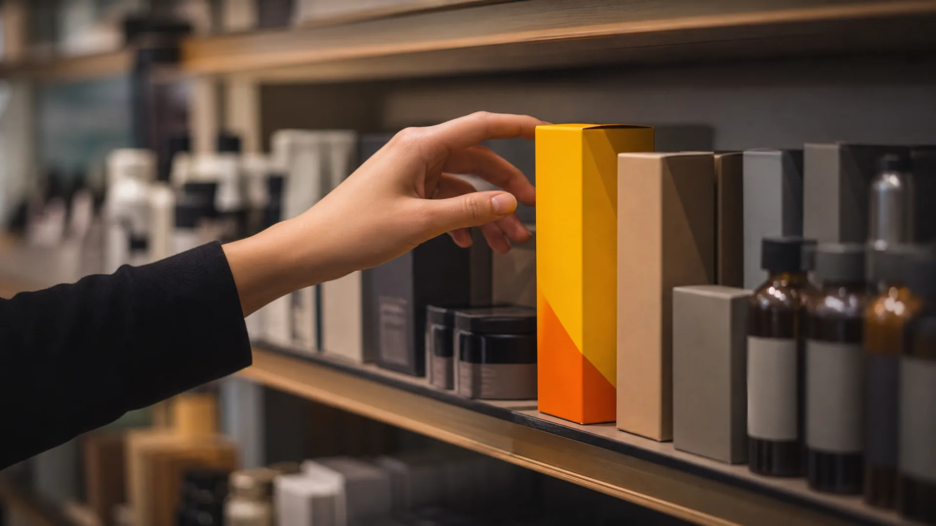
A shopper's eyes move fast across a shelf. In that brief window, colour, shape and finish do more persuading than any claim printed on the front of pack. This is packaging psychology at work. It's the reason two products with near-identical ingredients can perform very differently at retail.
For brand managers, understanding this isn't optional. It's the difference between a product that gets picked up and one that gets walked past.
What Is Packaging Psychology and Why It Matters for Shelf Appeal
Packaging psychology is the study of how design elements, colour, shape, texture and typography, influence a shopper's perception and buying decision. It sits behind almost every successful piece of shelf appeal packaging design, whether the brand behind it calls it that or not.
Shoppers don't read labels carefully before deciding what to look at. They scan. Colour blocks, contrast and shape register first. Brand name and claims come later, if at all.
That matters because most purchase decisions on a crowded shelf happen in seconds. Colour and contrast usually register before a shopper even reads a brand name or claim. If your packaging doesn't win that first visual pass, the rest of your messaging never gets the chance to work.
How Shoppers Actually Scan a Shelf
Retail shelves are visually noisy. Shoppers cope with a kind of visual triage. They scan for a familiar shape or colour, glance at anything that stands out, then narrow down to two or three options worth a closer look.
So packaging psychology isn't a nice-to-have for designers to layer on at the end. It's a practical brand management concern, because it directly affects conversion at the point of sale. A brand manager who understands this can brief designers and printers with far more precision than one who treats packaging as purely aesthetic.
Colour Psychology in Packaging: Choosing Shades That Sell
Colour is rarely a random choice on premium packaging. Brands usually select it to trigger specific category associations, and shoppers read these cues almost instinctively. Colour psychology in packaging works because certain shades have been used so consistently within categories that they've become shorthand for a product type or positioning.
Get the colour palette right, and you reinforce what the product already promises. Get it wrong, and you create confusion before a shopper has read a single word.
Common Colour Associations by Category
Certain colours have become near-universal signals within specific categories:
- Green, natural, organic, eco-positioned or plant-based products.
- Black, premium, luxury or high-performance positioning.
- Bright primary tones, value, everyday affordability, or energy and fun.
- Blue, trust, cleanliness, often used in dairy, healthcare and household categories.
- White with minimal colour, clinical, pure or dermatologically focused products.
These associations aren't fixed rules. But deviating from them needs to be a deliberate choice, not an accident of not knowing the category's visual language.
Avoiding Colour Clashes on a Crowded Shelf
Category conventions are useful, but they also mean shelves can end up full of near-identical colour palettes. If every competitor in a category uses green and white, a brand that also uses green and white risks blending into the background rather than standing out from it.
This is where consumer packaging behaviour gets interesting. Shoppers use colour to sort products into mental categories quickly. A brand that wants standout without confusing shoppers about what the product is needs to hold onto category cues while shifting contrast, shade or accent colour just enough to draw the eye. Small, deliberate deviations tend to work better than a complete colour departure from the category norm.
Typography and Layout: Quiet Cues That Shape Perception
Colour gets noticed first, but typography and layout do a lot of the quiet work that follows. Font choice, spacing, and hierarchy all shape how premium, trustworthy or accessible a product feels, often before a shopper consciously registers why.
This is central to label design consumer psychology. The same product name set in two different typefaces can read as either a mass-market grocery item or a considered, premium product.
Font Choices and Perceived Quality
Thin, well-spaced serif or refined sans-serif fonts tend to read as premium. Bold, condensed or heavily decorative fonts often signal value, energy or a mass-market position, depending on how they're used.
There's no single "correct" font for premium perception. What matters is consistency between the typeface, the colour palette, and the finish. A premium colour palette paired with a cluttered, oversized font undermines the very positioning the colour was meant to support.
Hierarchy and Legibility at Shelf Distance
Most packaging is designed on a screen or a printed proof held at arm's length. Shoppers view it from further away, often while walking past a shelf bay.
Information hierarchy needs to hold up at that distance. Brand name, key product benefit and any mandatory compliance information all need to be legible without the shopper stopping to squint. Get the hierarchy wrong, and the wrong element wins attention. A promotional flash might dominate over the brand name, or a compliance line might crowd out the one benefit that actually sells the product.
Getting this right isn't just about the packaging brief. It also matters at the print stage, which is why it's worth understanding briefing a packaging printer with a full specification before a design goes to production.
Finish and Texture: Creating Premium Packaging Perception
Colour and typography do most of the visual work, but finish and texture are what a shopper feels once the product is in their hand. This tactile layer often completes the premium packaging perception that colour and layout have already started to build.
In our experience working with FMCG brands across cosmetics, nutraceuticals and household goods, small changes to finish and colour contrast often make the difference between a product being picked up or passed over on a crowded shelf.
Gloss, Matte and Soft-Touch: What Each Signals
Each finish carries its own associations:
- Gloss, vibrant, eye-catching, often used for value or FMCG products wanting maximum shelf pop.
- Matte, understated, considered, frequently associated with quality and restraint.
- Soft-touch, tactile, premium, and increasingly popular for cosmetics and personal care.
Premium cosmetic and nutraceutical brands increasingly request matte and soft-touch finishes when they want to signal higher perceived value without changing the underlying product. One premium personal care range switched from a gloss laminate to a soft-touch finish with spot-UV highlights. Brand feedback shared with our design team pointed to noticeably stronger engagement at point of sale afterwards.
Finish choice interacts with colour and typography rather than standing alone. For a deeper technical breakdown, it's worth reading a piece comparing gloss, matte and soft-touch finishes rather than treating finish as an afterthought once the artwork is signed off.
Applying Packaging Psychology to Achieve FMCG Shelf Standout
Colour, typography and finish don't work in isolation. FMCG shelf standout comes from how well these three elements reinforce a single, clear positioning, not from how loud any one of them is on its own.
A brand that gets colour right but chooses a mismatched font, or nails the typography but skips a finish that supports the positioning, ends up with packaging that sends mixed signals. Shoppers pick up on inconsistency even if they can't say why something feels "off."
A Practical Checklist Before Your Next Print Run
Before briefing a designer or printer, it helps to run through a short set of questions:
- Does the colour palette match or deliberately depart from category convention, and is that choice intentional?
- Will the typography read clearly from typical shelf distance, not just up close on a screen?
- Does the font weight and spacing match the positioning you're aiming for, premium or value?
- Have you chosen a finish that reinforces the tactile impression you want shoppers to have?
- Does the finished pack still stand out when placed next to your closest competitors, not viewed alone?
- Have compliance and barcode requirements been built into the layout from the start, rather than squeezed in later?
Running through this list before artwork is finalised avoids costly reprints and missed opportunities at shelf. It's also worth reviewing common packaging mistakes FMCG brands make, since many of them trace back to skipping exactly these questions.
Brand managers working in cosmetics may also want to look at guidance on vetting a cosmetic packaging supplier, since finish quality depends heavily on the printer's capability, not just the design file. And because shelf appeal isn't static, it's worth staying aware of current packaging trends shaping shelf appeal as competitor packaging evolves.
Getting Packaging Psychology Right From Design to Print
Understanding packaging psychology gives a brand manager the right questions to ask. But knowing that soft-touch signals premium quality, or that green reads as natural, doesn't automatically produce packaging that delivers on that promise.
Execution matters just as much as theory. A soft-touch finish applied unevenly, or a colour that prints inconsistently across a run, undermines the psychology it was meant to support. Design decisions need to be paired with reliable print production, ideally from the same team that understands both.
Brand managers who want support turning these principles into a working brief may find it useful to start with working with a packaging design service that understands both the psychology and the print process behind it.
If you're planning a new product launch or a redesign and want packaging that's built to perform on shelf, not just look good in a proof, book a consultation with Gateway Print & Packaging's design team. We'll help you apply these principles to your next print run with confidence.