Common Packaging Mistakes FMCG Brands Make
Most packaging mistakes never make it into a case study. They show up quietly, as a delayed launch, a reprint bill, or a barcode that won't scan at the till. For FMCG brands managing multiple SKUs across busy retail channels, these errors are more common than most brand managers expect. This article works through the most common packaging mistakes FMCG brands make, based on what we see at file-check and pre-press stage every week.
Why Packaging Mistakes Cost FMCG Brands More Than Money
Packaging mistakes are rarely about bad design taste. They're almost always a breakdown somewhere between the brief, the artwork file, and the press. A designer might produce something beautiful on screen that simply can't be printed, cut, or folded the way it was imagined.
For established FMCG brands, the stakes are higher than they are for a new product launch. A reprint doesn't just cost money. It costs shelf space, retailer trust, and momentum you've spent months building.
The real cost of a reprint or delayed launch
A missed print deadline can push a listing date. Retailers don't always hold shelf space for a brand that isn't ready. Distribution slots, promotional calendars, and seasonal windows get booked well in advance. Miss one, and you may wait months for the next opportunity.
There's also the operational cost. Reprinting cartons or labels means re-ordering stock, re-scheduling production lines, and absorbing the wasted material from the first run. Understanding how reprints affect turnaround times helps brand managers plan realistic launch dates from the start, rather than reacting once something's already gone wrong.
Print-Ready File Errors That Delay Production
Most packaging errors get caught long before a job hits the press, if the file check is done properly. Print-ready file errors are the single biggest cause of delayed production we see, and most are avoidable with the right process.
Dielines, bleed and resolution issues
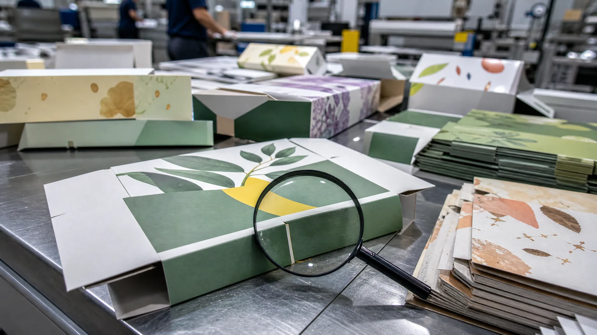
A dieline is the template that defines exactly where a carton or label gets cut, folded, and glued. Gateway's print team regularly receives artwork files with dielines that don't match the actual carton tooling. That mismatch only surfaces once plates are made, unless it's caught at file-check stage.
Other common issues include:
- Missing bleed, which leaves white edges after trimming.
- Low-resolution images that look sharp on screen but pixelate on a printed carton.
- Text or logos placed too close to fold lines, where they can crack or distort.
- Files built to an old or approximate dieline instead of the current, tooled version.
Each of these seems small on its own. Together, they're why so many jobs bounce back to the design team days before a planned print date.
Colour mode and Pantone mismatches
Designers often work in RGB, the colour mode used for screens. Print runs on CMYK or spot Pantone colours, and the shift between the two can be dramatic. A vivid on-screen orange might print noticeably duller. A brand's signature blue might drift towards purple.
Pantone mismatches happen when a brand's specified colour isn't clearly called out in the file, or when a printer substitutes the nearest CMYK equivalent without flagging it. For a brand that depends on colour consistency across a shelf full of SKUs, this is a serious risk, not a cosmetic one.
Label Artwork Mistakes That Undermine Shelf Impact
Labels carry more pressure than most brand teams realise. They need to look sharp, scan correctly, and stay consistent across every variant in a range. Label artwork mistakes tend to surface in exactly those three places.
Barcode sizing and placement errors
Barcodes have minimum size and contrast requirements for a reason: below a certain scale, scanners simply can't read them reliably. A cosmetics brand relaunching a product range can lose weeks of shelf time if a barcode fails to scan at the till. That happens when a barcode gets scaled down below the minimum size during a last-minute layout change.
Placement matters too. A barcode positioned over a fold, a seam, or a curved surface can distort just enough to cause scan failures at the point of sale, long after the artwork was approved.
Inconsistent colour and finish across SKUs
Shoppers recognise packaging by colour and shape before they read a single word. Even a small colour shift between a screen proof and the final printed carton can be enough for a shopper to walk past a product they've bought before. Packaging recognition relies heavily on consistent colour, and that consistency needs to hold across every SKU in a range, not just the hero product.
The same applies to finish. A matte variant sitting next to a gloss one on the same shelf, when the brief called for a uniform look, undermines the polished range feel retailers expect. Choosing consistent label finishes across a product line is one of the simplest ways to protect that shelf impact.
Carton Design Errors That Affect Structure and Shelf Fit
A carton that looks perfect as a flat artwork file can fail completely once it's folded, glued, and stacked. Carton design errors usually come from designing without structural knowledge, or without checking real-world constraints early enough.
Ignoring structural tolerances
Every carton material has tolerances: small variances in how board behaves when it's cut, scored, and folded. A design that ignores these tolerances might look fine as a flat proof but fail to close properly, sit unevenly, or crush at the corners once filled.
This is especially common when a design gets adapted from an existing template without re-checking the structural engineering for the new product's weight, shape, or fill method.
Overlooking retailer shelf and pallet requirements
Major retailers often specify shelf depth, height restrictions, and pallet configurations that a carton must fit within. A design that's a few millimetres too tall, or doesn't stack efficiently on a standard pallet, can trigger delisting or costly last-minute redesigns.
Getting carton design right from the start means checking these constraints during the design phase, not after the first production run has already been printed and delivered.
Packaging Compliance Mistakes in Regulated Industries
Compliance mistakes carry a different kind of risk. A structural or colour error costs money and time. A compliance error can get a product pulled from shelves or blocked from sale entirely.
Missing mandatory label information
Cosmetics, nutraceuticals, pharmaceuticals, and household chemical products all carry mandatory label information. This typically includes ingredient lists, net content, manufacturer details, and usage instructions. Missing any one of these can hold up a launch at the compliance review stage, well after artwork has been finalised.
Nutraceutical and pharmaceutical labels are especially prone to these mistakes. Ingredient lists, warnings, and registration numbers must meet specific regulatory formatting rules before print. Reviewing nutraceutical label compliance requirements before finalising artwork can catch gaps that a design team, focused on layout rather than regulation, might easily miss.
Getting warnings and registration numbers wrong
Warning statements, hazard symbols, and registration numbers are often treated as an afterthought, added late in the design process rather than built in from the brief. That's when errors creep in: an outdated registration number, a warning in the wrong font size, or a hazard symbol positioned where it's not clearly visible.
For cosmetics brands in particular, vetting a cosmetic packaging supplier for compliance experience, not just print quality, is one of the more overlooked steps before a launch.
How to Avoid Packaging Mistakes on Your Next Product Launch
Every mistake covered so far shares a common thread: the right process would have caught it before the press ran. Avoiding packaging mistakes isn't about perfection. It's about building in checks at the right points.
Building a proper packaging brief
A clear brief is the foundation everything else depends on. It should cover dimensions, materials, finishes, compliance requirements, and retailer-specific constraints before a designer opens a file. Briefing a packaging printer properly up front removes most of the guesswork that leads to structural and file errors later on.
Using proofs and mockups before committing to print
A digital proof shows colour and layout. A physical mockup shows how a carton actually folds, closes, and holds its shape on a shelf. Neither should be skipped, even under launch-date pressure. Using mockups to catch errors before print gives brand teams a last, tangible checkpoint before a full production run locks in.
A short checklist worth running before any print job goes to press:
- Confirm the dieline matches current tooling, not an old template.
- Check colour mode and Pantone references against the brand's approved palette.
- Verify barcode size, placement, and contrast against scanning standards.
- Review mandatory label information against current regulatory requirements.
- Request a physical mockup for any new structural design.
Working with a print partner who understands packaging, not just printing, is what catches most of these issues before they become expensive. If you're preparing for a launch or a range refresh, Gateway's team can run a free artwork review or share our print-ready checklist before your next production run goes to press.